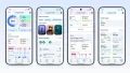
The first Health Guardian reports arrived on October 1, and r/PixelWatch filled up with a very specific kind of confusion. People with recent, normal lab results were opening the Google Health app to find out their insulin resistance is high.
Thread after thread, the same pattern. Someone says their bloodwork is fine and the watch disagrees with it. Someone else says they got low and everything is fine. Both people think their result is correct.
What Actually Landed
Google started rolling out Health Guardian last week to Pixel Watch 3, 4 and 5. The monthly report carries three new metrics:
- Insulin resistance trends
- Blood pressure trends
- Sleep breathing quality
Reports are monthly, which is why the first batch showed up on the first of the month rather than at launch. We covered the device tiering and which watch gets what when the rollout started.
The mechanics are the part people keep missing. A Pixel Watch is not measuring blood pressure in mmHg, and it is not measuring glucose or insulin. Blood pressure trends run on Google's WavesFM foundation model, trained on billions of minutes of raw heart and movement data, analyzing the shape and speed of the pulse under the skin alongside motion. Insulin resistance combines heart rate patterns, HRV, sleep, activity, skin temperature, weight and age. We went through the indirect method in our insulin resistance explainer.
The output is deliberately broad. You get a trend. You do not get a number.
There Is a Ceiling on This, and It Is Published
Before the anecdotes, here is the honest number. In Google's own validation data, insulin resistance accuracy was 75% from wearable data alone and 88% when lab results were included, as Empirical Health laid out in its analysis of the method.
That is a genuinely impressive result for a wrist device with no glucose sensor. It also means that on wearable signals alone, roughly one in four assessments will not match what a lab would tell you. A "High" flag landing on someone with normal bloodwork is not a malfunction. It is inside the error rate the method is documented to have.
The Wording Is Doing Real Damage
The blood pressure trend resolves to either "High" or "Not high." Android Police's Rita El Khoury, whose partner got the all-clear, found the "not high" phrasing alarming before working out that it simply means normal. She suggested Google should have written "normal" instead.
Read that back. The reassuring result needs decoding. When the good outcome is phrased as the absence of the bad one, people reasonably read it as a warning. Insulin resistance has the same shape: "high" versus "low," with no scale and no indication of how close to the boundary you landed.
Why the First Report Is the Weakest One
Part of the confusion on day one was how Google produced a verdict so fast. The answer is that it did not need a week of visible app data.
Google says the first blood pressure trends report can appear if you wore a compatible Pixel Watch for at least five consecutive days during September. Insulin resistance trends requires at least seven days and nights of wear during the month. The report is delivered in October but describes September.
A commenter going by L0nz made the point that matters for how much weight to put on this:
"Updates are monthly but that does not mean they use a month's worth of data to produce it. The first is as little as 7 days' data, the next will be at least 14 days, the next 21 days etc etc because each update builds on the last. The first update is by definition the least accurate."
Treat the escalating window as the community's inference rather than a Google statement, since Google has only confirmed the minimum thresholds. But the conclusion holds either way: this is the least informed report you will ever get from the feature. Every one after it has more data behind it.
What the Community Actually Reported
The range is what makes this interesting, because it is not a story about the algorithm failing.
People who expected a high flag and got one. TeamGullet was blunt about it: "Mines high also. I get about Four to five hours of sleep. I eat like crap and work 12hrs a day almost daily and fighting a chest cold. It makes sense." Omoion got a high result and traced it to a recent change: "it's very likely mine's high because I started lifting weights and working out regularly starting in September." The original poster, Mathrania, took a high insulin resistance flag on a Pixel Watch 4 as a prompt rather than a verdict: "I think it's time that I focus on my health, my lifestyle, my eating habits, and the sedentary lifestyle."
People who got the opposite of what their lifestyle suggests. RaccoonDu reported "low" and said it reflected correctly given how seriously they take their health. Top_Papaya_9836 reported the reverse: "as someone who works out 5 days a week, mine says high, which according to my latest lab results in April combined with me taking my health seriously as well, is incorrect." Same effort, opposite results, both confident.
People whose recent labs contradict it. cerealsnax: "I literally just had my a1c taken and it's well within the healthy range and I got high on insulin resistance. It's incorrect." Particular-Fennel-67 described a doctor's test improving between March and September and still getting a high flag, adding that a friend on GLP-1 medication who is not prediabetic was flagged high too. londondragonite had full blood tests come back fine, is on GLP-1s, and hits 150 to 200 minutes of exercise a week: "I strongly suspect they would change if I put my weight down as lower."
The one that inverts the premise. A type 1 diabetic, sinistersquirrels, got the high alert while knowing their insulin resistance is better than it has ever been, and offered their own explanation: "I have been having a stressful time at work this month so that probably explains the alert."
That last one is not a user misreading the feature. It is the feature behaving as designed, and the design is the problem.
The AI Coach Says the Quiet Part
The most useful thing anyone posted came from FusionHype23, who pasted the in-app coach's own explanation. Two lines in it explain nearly every confusing result in the thread:
"Research published in Nature shows these wearable signals can identify metabolic strain often before standard blood tests like HbA1c show a change."
"High acute stress, sleep deficits, and training fatigue, things we've seen in your logs, can all temporarily increase metabolic stress and influence this trend."
Read those together and the day-one reaction makes sense. The feature is explicitly designed to flag strain that a blood test has not caught yet, and it explicitly counts stress, bad sleep and hard training as inputs. Someone who started lifting in September, or had a brutal month at work, or changed their diet hard while training, can get a high flag because of the behaviour their bloodwork is rewarding, not in spite of it.
That is a defensible design. It is also completely invisible if you only read the word "High."
What Google Says These Are
The disclaimers are explicit:
- "Intended for general wellness and informational purposes only" and not intended to diagnose, treat, cure or prevent any medical condition
- Not a prescreener for diabetes, hypertension or sleep apnea
- They do not provide real-time clinical readings
- They should not be used to adjust medications or treatment plans
- They are not for use by people who are pregnant
The naming changes by country too. In Japan and Mexico, blood pressure trends ship as Vascular Stress or Vascular Stress Trends, and insulin resistance as metabolic stress trends. That is arguably the more honest label, since "stress" describes a pattern rather than a condition.
Fitbit Air users get insulin resistance and blood pressure trends later this year, and that access requires a Google Health Premium subscription.
The reports themselves are worth one more note. El Khoury's own Pixel Watch 5 report flagged all three metrics, which matched her circumstances, while her healthy partner on a Pixel Watch 3 got low insulin resistance, "not high" blood pressure and "mostly optimal" sleep breathing. Both reports were plausible. That is the whole difficulty in one household.
What the Report Doesn't Give You
The most reasonable criticism in the thread is about what is missing. mngeekguy put it simply: "My gripe here is that it tells you what the problem is, but not what to do about it."
There is a strong argument that the reports are too sparse. Android Police found no other way to consult them in the app beyond the initial card, and noted that insulin resistance arrives with no explanation at all, while only sleep breathing breaks out how many days fell into each quality band. No magnitude, no direction, and no "here is what changed since last month." If an algorithm is going to flag something potentially serious, people want to know what moved and by how much.
The thread's own consensus landed somewhere sensible. Prudent_Honeydew_ got good readings and framed it well: "taken with a grain of salt it could be a good indicator that one may want to get things checked out." jake0456 got a low result that matched recent annual bloodwork, and still made the right caveat: "without actually measuring glucose in the blood this is just a guesstimate based on other metrics that the watch can actually measure."
Bottom Line
The algorithm is probably working about as well as a 75% method can. The labels are failing.
A big "High" on your wrist, next to a blood test that came back normal, will cause anxiety in anyone, and "not high" is a poor way to say "normal." Both are messaging choices rather than sensing limits, and both are cheap for Google to fix.
If your first report flagged something, the accurate reading is this. It describes a September pattern drawn from pulse, sleep, movement and stress signals, it needs as little as five to seven days of wear to appear, it is documented at roughly 75% accuracy on wearable data alone, and Google says it is not a diagnostic tool. It is a prompt to look into something, or to raise at your next appointment. It is not a result to act on.
You will also get a better report next month, and a better one the month after, because the whole design depends on watching a trend move. That is the part day one cannot give you, and the part the "High" label does nothing to explain.
If you want the hardware side of where this is heading, Google has been patenting blood pressure sensing that does not rely on pulse and motion patterns at all.
Sources: Google's official Health Guardian announcement and rollout posts for the feature list, the Pixel Watch 3, 4 and 5 free inclusion, the Fitbit Air timing and Google Health Premium requirement, the monthly cadence, the WavesFM blood pressure model and its training data described as billions of minutes of raw heart and movement data, and the full disclaimer text including the general wellness limitation, the not-a-prescreener statement, the real-time readings exclusion, the medication warning, the pregnancy exclusion and the Japan and Mexico naming; the G&W account of the October 1 reporting day for the five-consecutive-day blood pressure and seven-day insulin resistance thresholds, the September data window and the October labeling quirk; Empirical Health's analysis of the wearable insulin resistance method for the 75 percent wearable-only and 88 percent with-labs accuracy figures from Google's validation data; Android Police's first-hand Pixel Watch 5 and Pixel Watch 3 reports for the "High" and "Not high" wording, the "not high" confusion, the missing insulin resistance explanation, the sleep breathing day breakdown and the healthy-partner all clear; and the r/PixelWatch thread "Pixel Watch 4 - High Insulin resistance trends" and its comment section for the quoted user reports from Mathrania, FusionHype23, RaccoonDu, Top_Papaya_9836, Particular-Fennel-67, cerealsnax, londondragonite, sinistersquirrels, TeamGullet, Omoion, jake0456, Prudent_Honeydew_, mngeekguy and L0nz, plus the in-app AI coach text, with the escalating-report-window claim attributed to the commenter rather than to Google.